A category for positioning UIView with ease.
January 25, 2013
Let’s take the code below:
CGRect rect = button.frame;
rect.origin.x = tableView.frame.origin.x;
rect.origin.y = tableView.frame.origin.y + tableView.frame.size.height;
button.frame = rect;
Assuming button and tableView are in the same superview, the code aligns button just below tableView and to the left. That’s grand, but there’s a lot of boilerplate code around and if you’re not using nib files, you’ll be writing a lot of code like this. Actually, even if you do use nib files you’ll probably going to write this stuff often enough to become a nuisance.
So here are some categories that make things smoother. They provide a simple way of aligning your views relative to siblings or to arbitrary points. So the above code becomes:
button.topLeft = tableView.bottomLeft;
Which basically translates to:
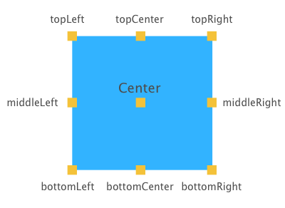
The top left anchor point of button will be in the same position as the bottom left anchor point of tableView.
Here you go, a graphical representation of each anchor point for a better understanding:

It comes in many other flavours:
//centers the views vertically, aligns on top horizontally
button.topCenter = tableView.topCenter;

//aligns on right vertically, centers horizontally
button.middleRight = tableView.middleRight;

button.bottomCenter = CGPointMake(10, 20);